Moonpig rebrand
D&AD Pencil Award Winner for Logo
Transform Silver Award Winner for Typography
Selected for Creative Review Annual 2018
Design Week’s Top 10 Logos of 2017
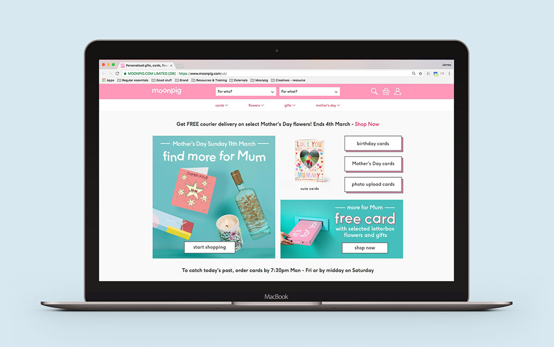
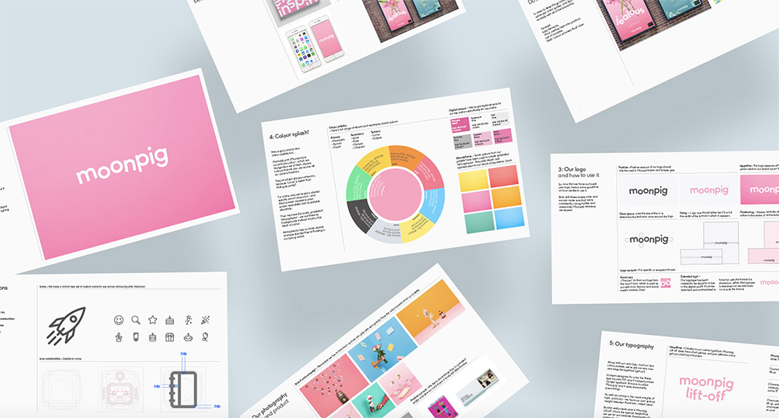
To support the growth ambitions for the business we embarked on a re-brand to combat a market perception of low quality and gimmicky, without losing the fun that has made Moonpig so successful. This project started from my first day at Moonpig and was built from the inside out, bringing in Industry experts to collaborate with the in-house teams.
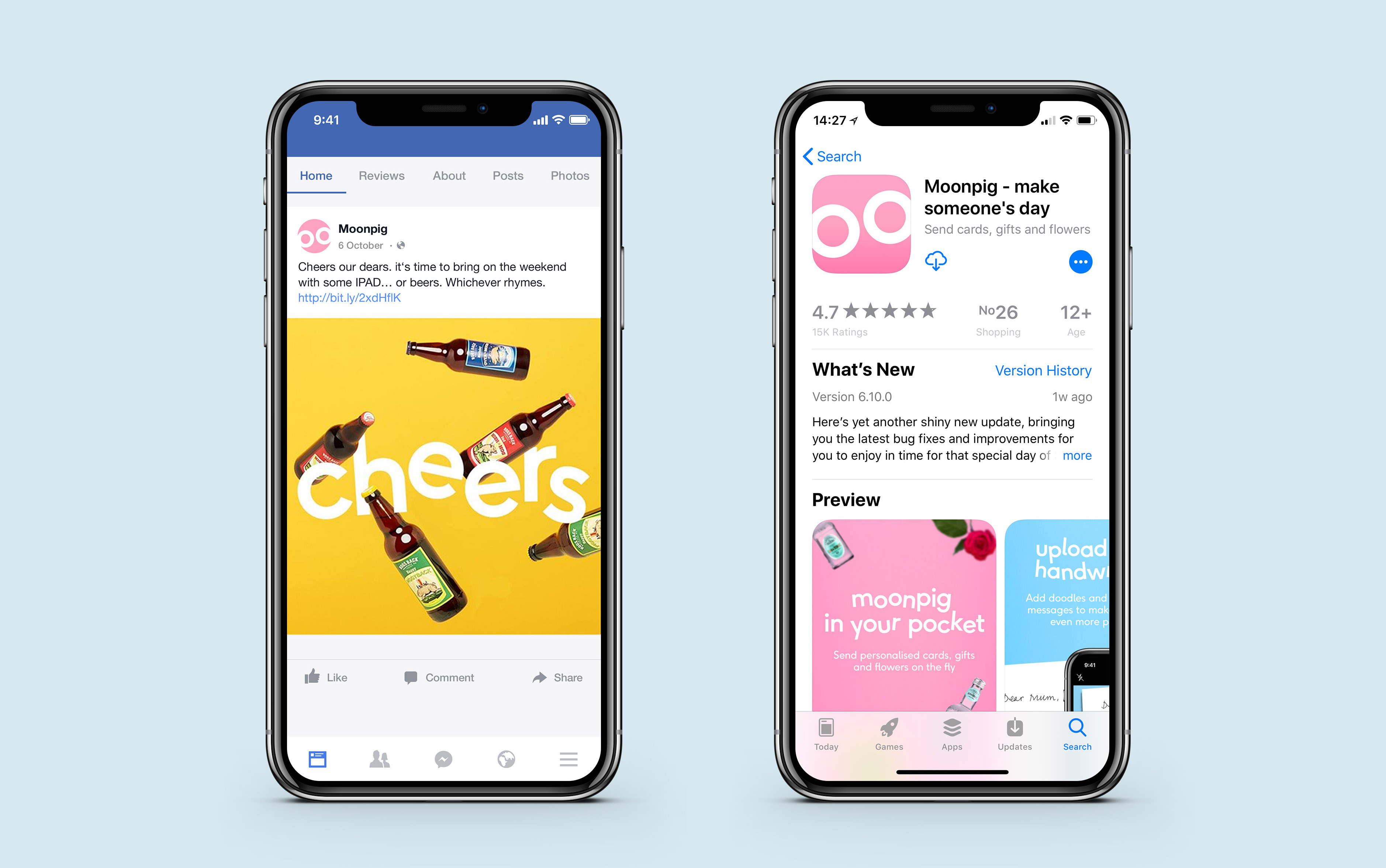
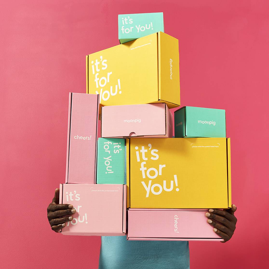
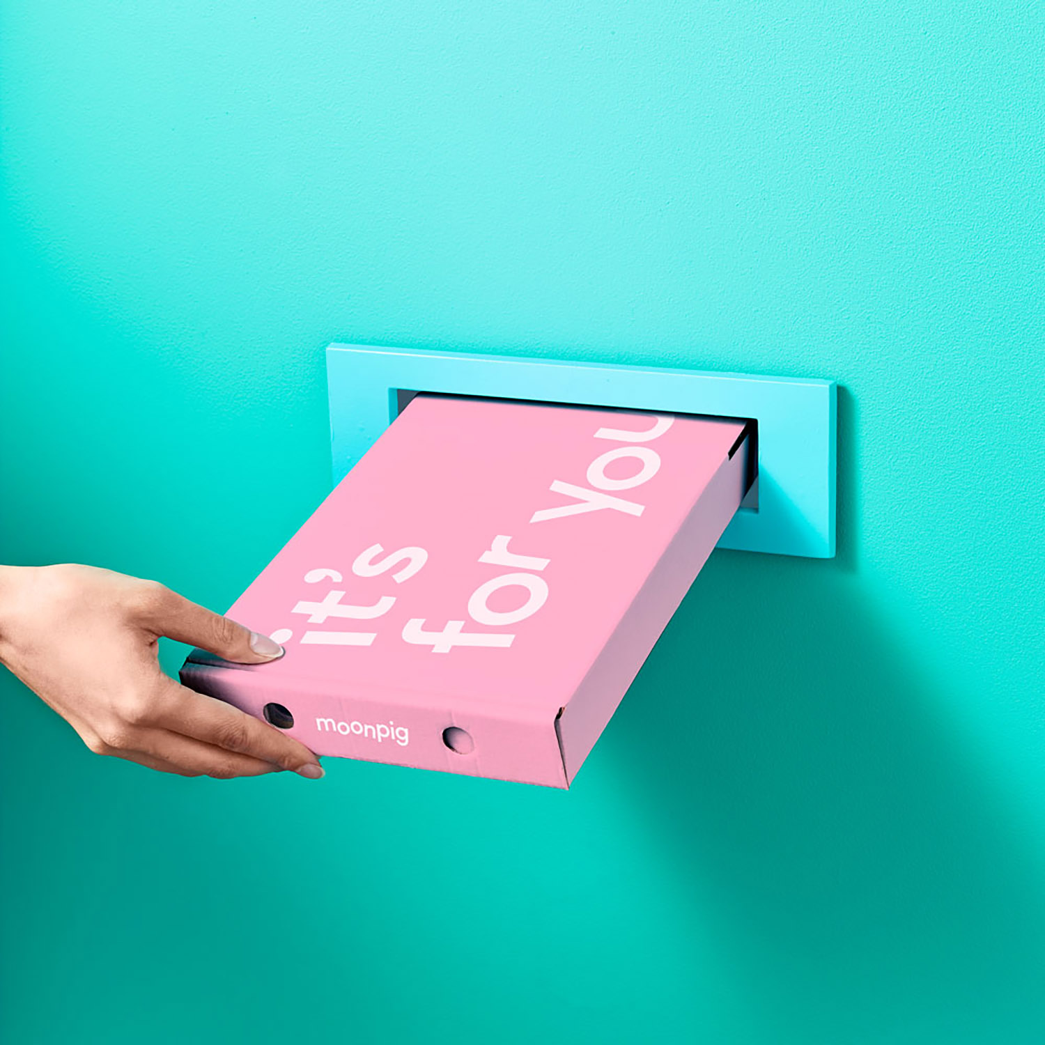
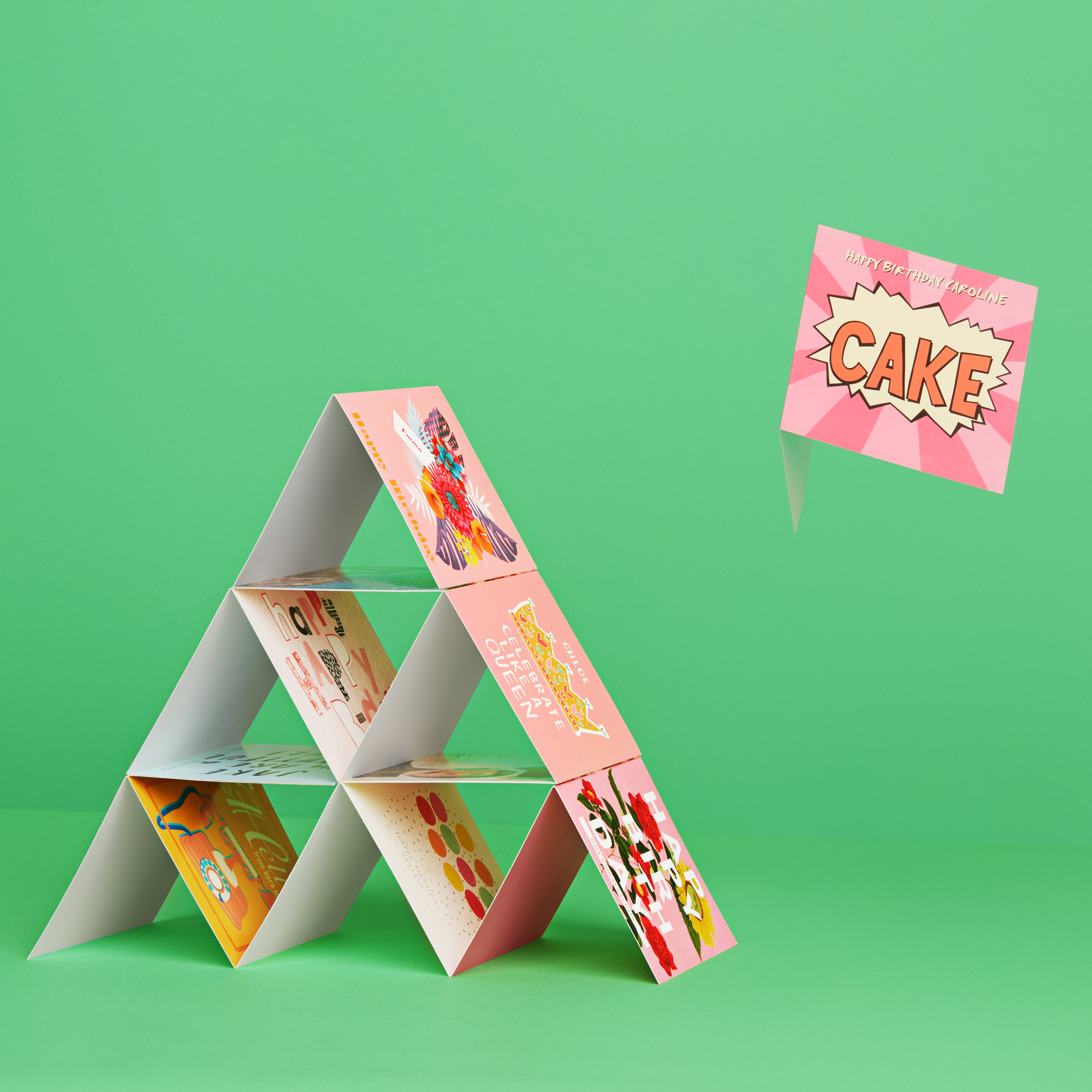
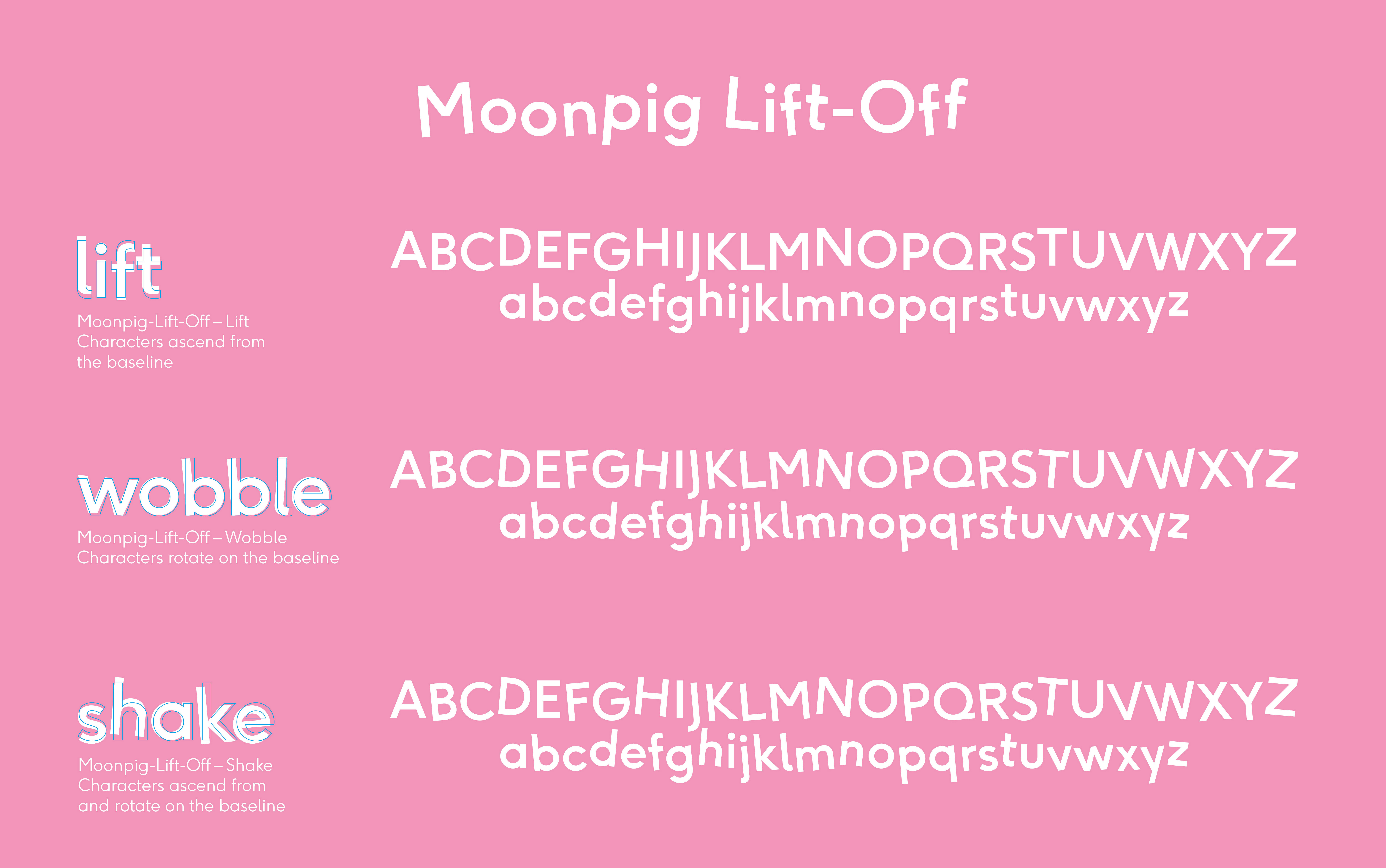
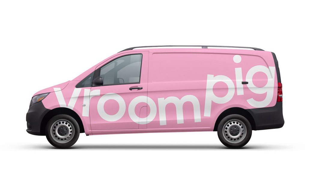
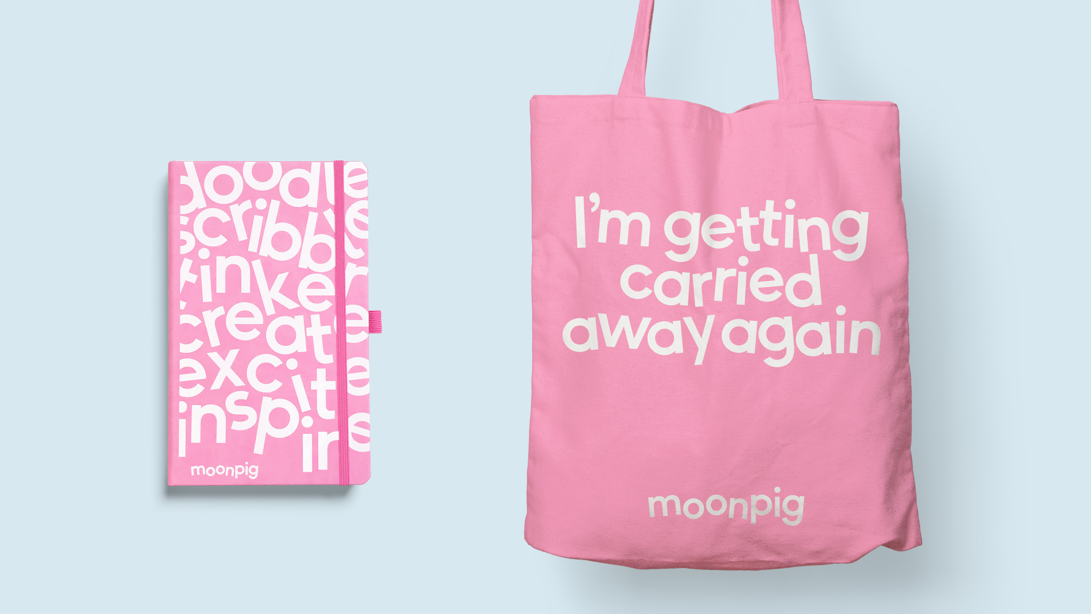
The new positioning was interpreted into a simple creative idea: ‘life is more light-hearted on the moon’. App and social icons were designed to playfully reference a pig’s snout, while animated versions of the logotype interact with the Brand’s signature jingle. This new light-hearted aesthetic has been playfully crafted to touch everything from the logotype, a custom font and art direction.